Constraint 01
Regulatory
IRDAI guidelines constrain how health data can be surfaced and what behaviours can be gamified inside an insurance product. Compliance and accessibility had to be maintained at every step.
“Insurance apps only get opened when something goes wrong. We made one that gets opened daily.”
From an insurer-focused app to a health companion with insurance built in. A behavior-led redesign of Aditya Birla Health Insurance's flagship product — driving engagement, retention, and reward redemption.
Client
Aditya Birla Health Insurance
My Role
Lead UX Designer — Experience strategy, IA, home model, reward framing & key flows (owned); metrics, rollout & cross-functional alignment (influenced)
Timeline
8 Months
Project Context
02 / 12Overview
Activ Health had high acquisition but low retention. Users had no reason to open the app unless something went wrong. The redesign shifted the app's positioning from an insurer-focused product to a health companion with insurance built in — building daily-use moments through tracking, rewards, and contextual wellness, while keeping policy and claims one tap away.
The Core Problem
I don't have a reason to open an insurance app unless something goes wrong. It's stressful, confusing, and not helpful day-to-day.
The Brief
Redesign Aditya Birla Health Insurance's Activ Health app to shift it from an insurer-focused product into a daily health companion — driving engagement, reward redemption, and retention through behavior-led design.
Deliverables
Team
How Might We
How might we give users a reason to open the app when nothing is wrong?
How might we make HealthReturns™ rewards feel motivating and legible — not buried in policy fine print?
How might we turn fragmented health signals (steps, calories, gym, vitals) into a single sense of progress?
How might we make claims feel transparent and trustworthy in an emotionally heavy moment?
Constraints
IRDAI guidelines constrain how health data can be surfaced and what behaviours can be gamified inside an insurance product. Compliance and accessibility had to be maintained at every step.
Redesign ran in parallel with a React Native migration. Rollout had to be phased so design changes shipped predictably as platforms reached parity.
Insurance carries low inherent trust. Every design decision had to reduce ambiguity — especially in claims and rewards — rather than add delight at the cost of clarity.
The Challenge
03 / 12High acquisition with low retention. Users avoided weekly returns, underutilized rewards, and the app suffered weak differentiation in a category dominated by transactional, claims-focused experiences. Health insurance apps were opened only when something went wrong — making engagement, reward redemption, and renewal conversion structurally hard.
How Might We
How might we give users a reason to open the app when nothing is wrong?
What was broken
Research & Discovery
04 / 12Methods
Conversations with policyholders across age and health segments — focused on why the app was opened, when it was abandoned, and what reward framings actually motivated return visits.
Qualitative
Behavioural data on weekly active users, reward redemption funnels, and drop-off patterns across home, claims, and tracking surfaces in the existing app.
WAU + redemption
Audited reward and health-tracking patterns across health-insurance and consumer-health apps to surface conventions worth keeping and assumptions worth breaking.
Category audit
Prototype testing on the new home model, Activ Dayz™ engagement engine, contextual wellness, and claims flow — validating that reward visibility and progress legibility actually changed return intent.
Iterative rounds
Key Findings
Behavioural data showed that tracking features, in isolation, fail to create habit. Users return when there's a tangible reward connected to the behaviour — not when the app simply logs it.
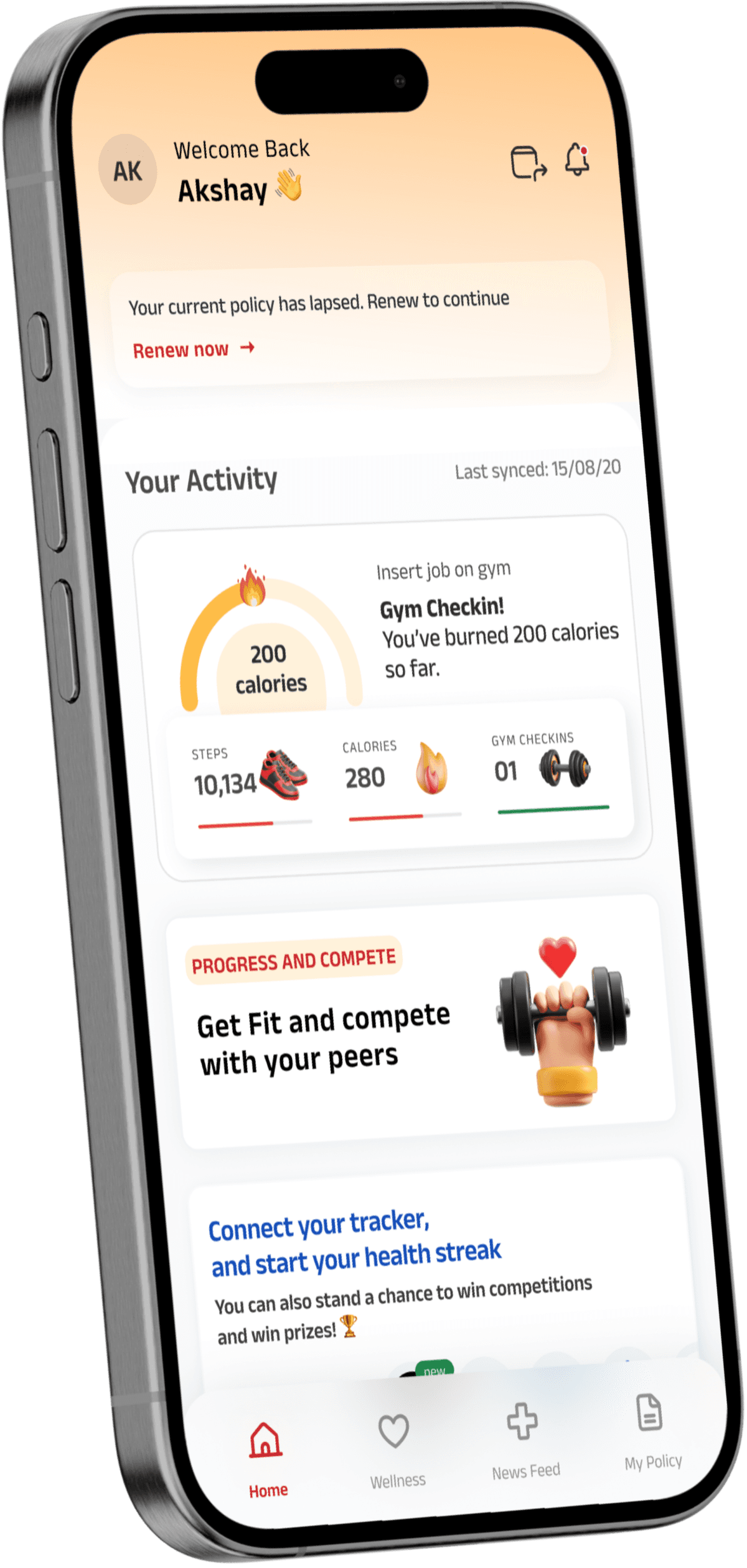
Drop-off patterns on the existing home screen showed users couldn't find a reason to come back. The app needed a clear, daily incentive surfaced at the top — not buried under policy modules.
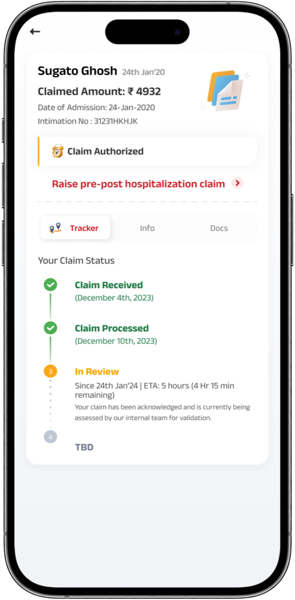
Claims happen during stressful health events. Transparency — clear status, timestamps, next steps, and timelines — reduced confusion more than speed did.
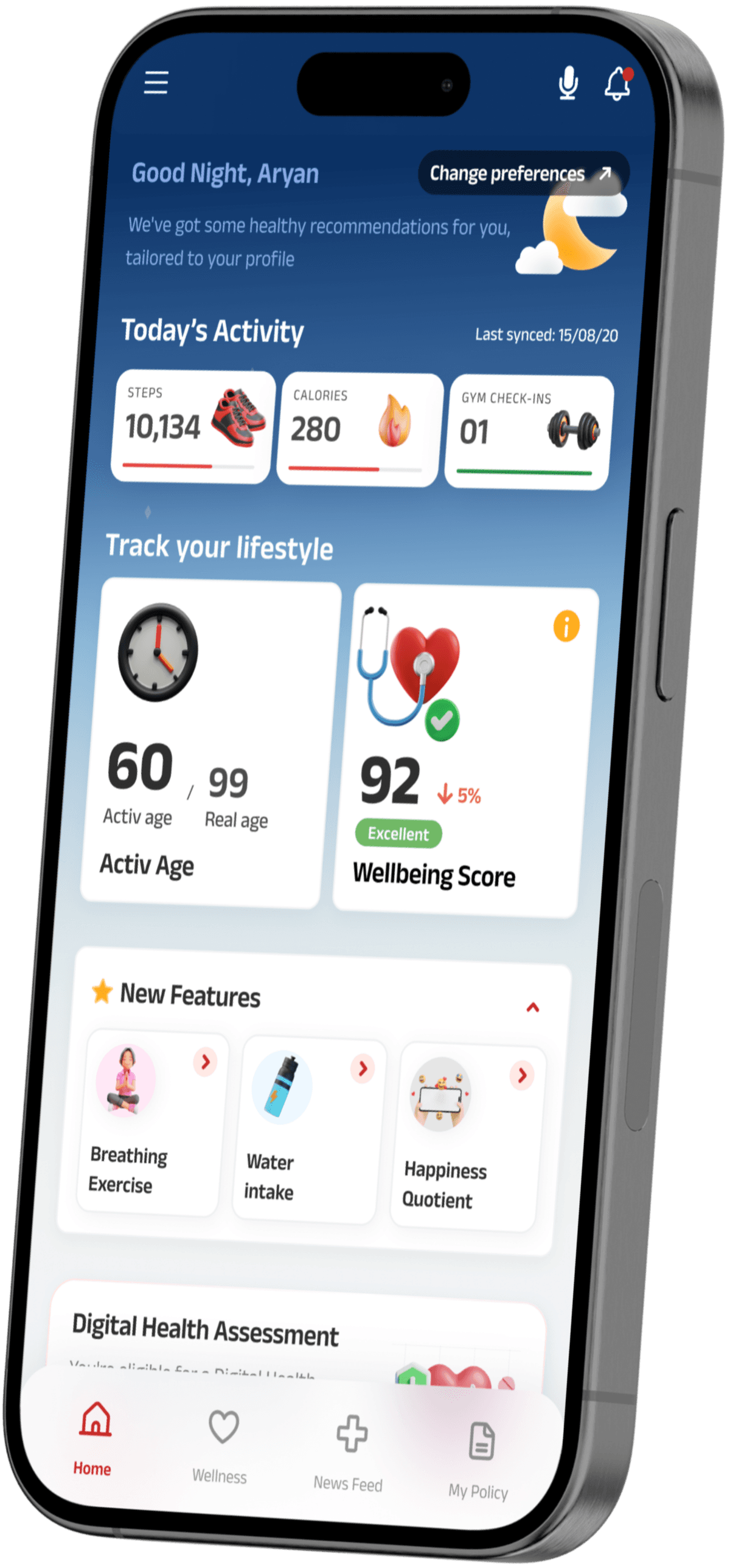
Discovery patterns showed that surfacing wellness actions contextually (tied to scores, recent activity, reports) drives engagement far more than listing them in a static menu.
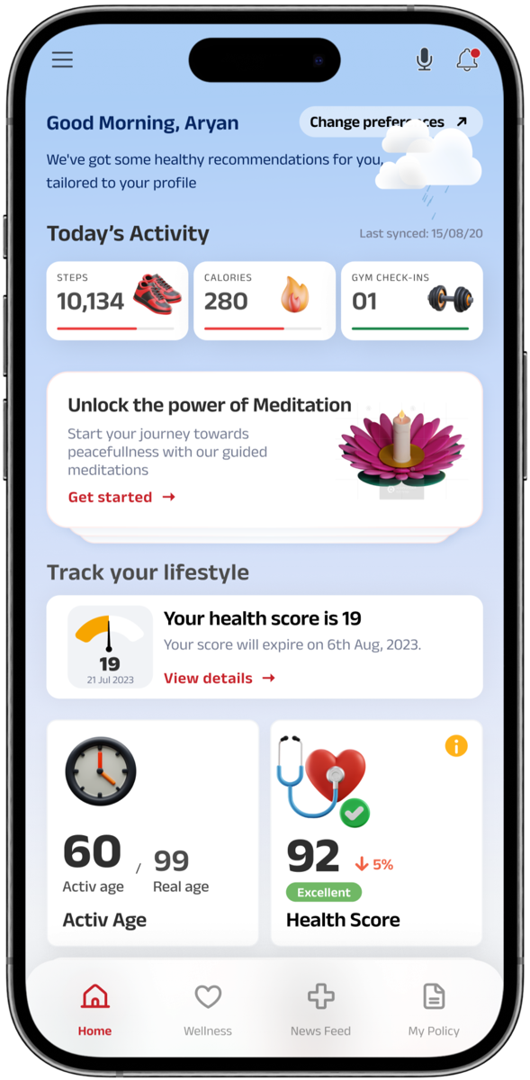
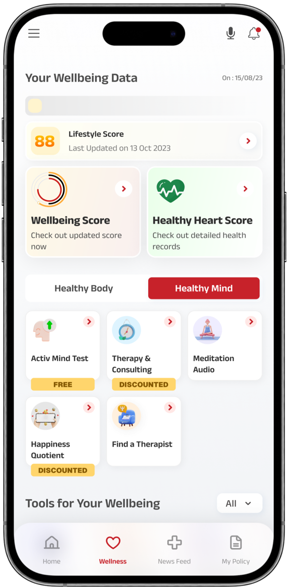
Information Architecture
Progress centre — Activ Dayz™, challenges, today's signals, contextual wellness
HealthReturns™ balance, redemption catalogue, streaks, milestones
Tracking, vitals, connected devices, wellbeing actions
OCR-assisted intake, per-document status, timelines, history
Coverage, members, renewals, documents
User Personas
05 / 12Persona 01
Working professional, fitness-tracking habit · 29
“I already track my steps. If the app rewarded me for what I'm already doing, I'd actually open it.”
Goal
Earn HealthReturns™ for the healthy behaviour she's already doing — without extra effort or noise.
Frustration
Can't tell what her rewards balance is, what counts toward it, or how to redeem it.
Behaviour
Daily fitness tracker user. Opens insurance app only at policy renewal or for a tax document.
Persona 02
Family policyholder, chronic-condition manager · 52
“When something goes wrong, I just need to know what to do next. The app gives me forms, not answers.”
Goal
File claims confidently, track status transparently, and feel that his family is genuinely covered.
Frustration
Claims experience feels opaque and stressful. He doesn't know what's next or how long it'll take.
Behaviour
Reactive app user. Calls the helpline whenever anything important happens because the app doesn't reassure him.
Process
07 / 12Discover
Audited the existing experience and analytics with the product team. Mapped user mental models around insurance, rewards, and health behaviour to understand why the app failed to build daily presence.
Define
Reframed the design problem around a behavior-led question: what would it take for users to open this app on a healthy day? Separated the IA into daily moments (tracking, rewards, wellbeing) versus episodic moments (policy, claims).
Concept
Defined the engagement loop hypothesis — healthy behaviour → Activ Dayz™ → HealthReturns™ → habit. Concepted home models around progress instead of menu, with policy and claims progressively disclosed.
Design
Designed the new home model, reward framing, contextual wellness surface, and simplified claims flow. Built the component system in parallel with the React Native migration to keep platform parity.
Validate
Validated drop-off patterns and reward legibility through prototype testing and behavioural analytics. Iterated on home progress, reward visibility, and claims transparency before handoff.
Ship
Phased rollout coordinated with the React Native migration. Tracked weekly active users (WAU) and reward redemption rate as primary success metrics through the first two release cycles.
Data Model
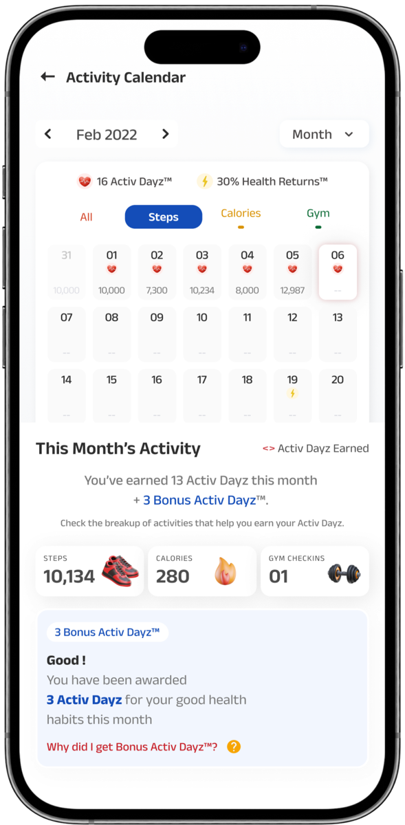
Core PrimitivesThe unified engagement currency. Every healthy behaviour — steps, calories, gym check-ins, vitals — converts into Activ Dayz, which roll up into HealthReturns™ benefits.
Attributes
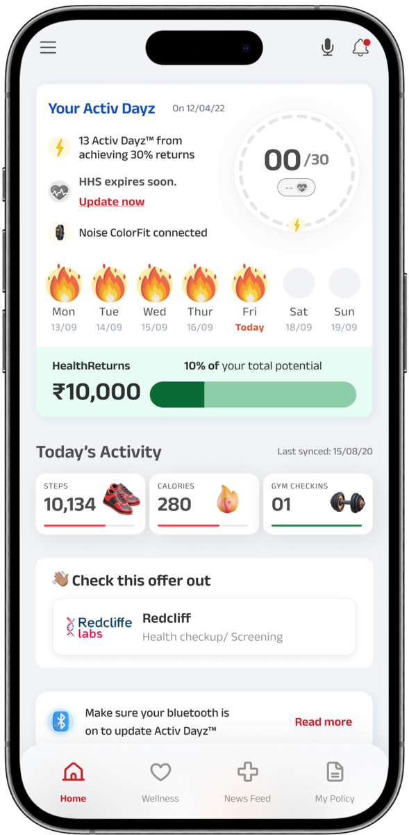
The reward layer that turns Activ Dayz into claimable benefits — premium discounts, partner offers, wellbeing services. The visible value behind daily engagement.
Attributes
Modelled before a single screen was designed — every primitive defined first, UI followed.
Design Decisions
08 / 12Every significant design decision was a deliberate choice with a rationale. Here are the ones that shaped the product most.
Context
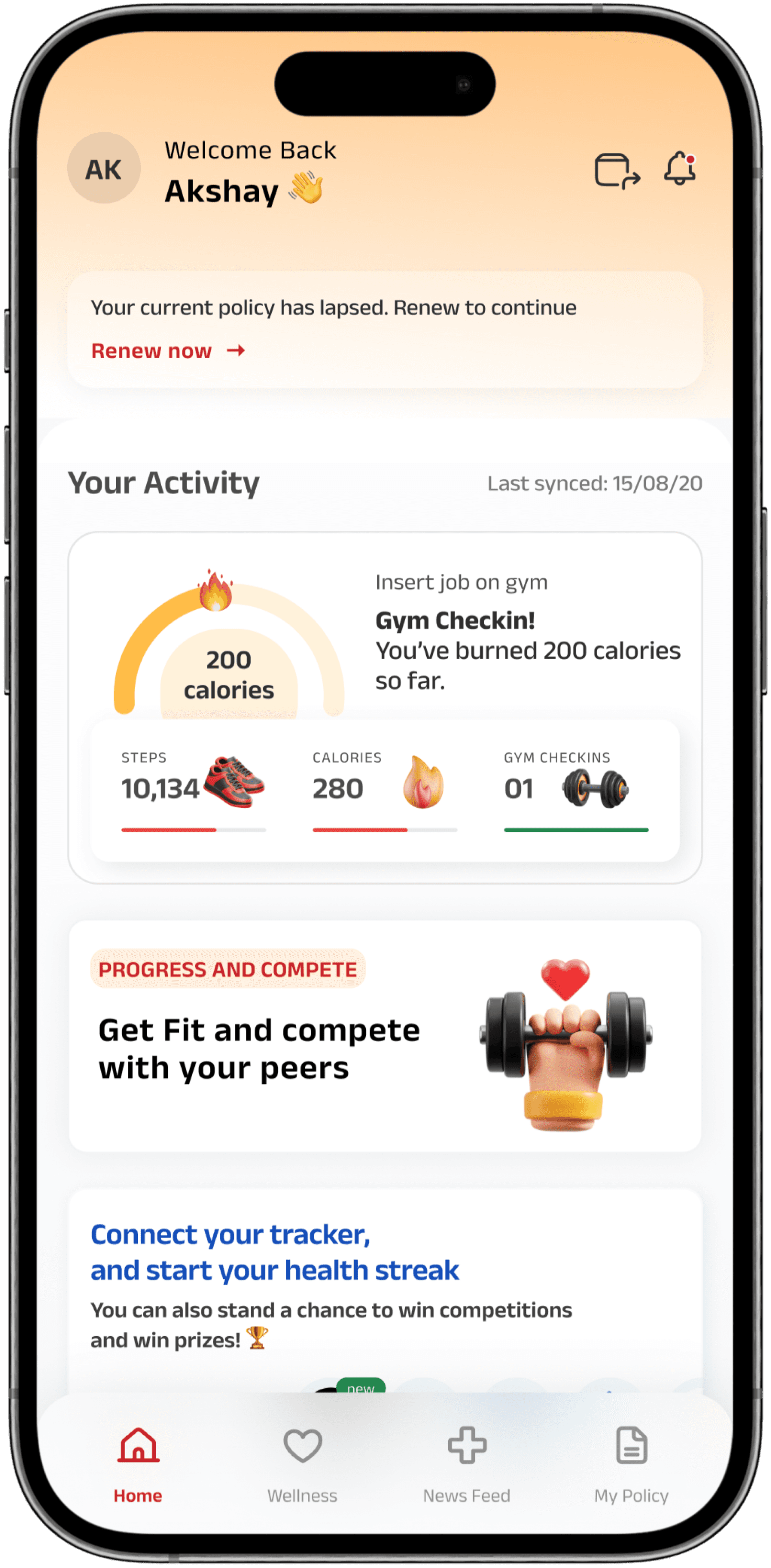
Drop-off patterns showed users needed a clear return incentive at the top level. Reducing module visibility was a calculated trade-off — accepted because the data showed the menu wasn't being used as a navigation aid; it was the reason people stopped opening the app.
Choice
Replaced menu-style navigation with a dynamic progress dashboard. Policy and claims kept progressively disclosed rather than featured as top-level modules.
An insurance app opened reactively never builds habit. Anchoring the home on progress (Activ Dayz™, challenges, health signals) gives users a daily reason to return — and makes the rest of the product discoverable as a consequence of engagement, not a precondition.
Impact
High — primary lever behind the 85% increase in active users.
Context
Trade-off: prioritised simple progress indicators over deep analytics. Behavioural research showed users wanted to know if today went well, not analyse last 30 days.
Choice
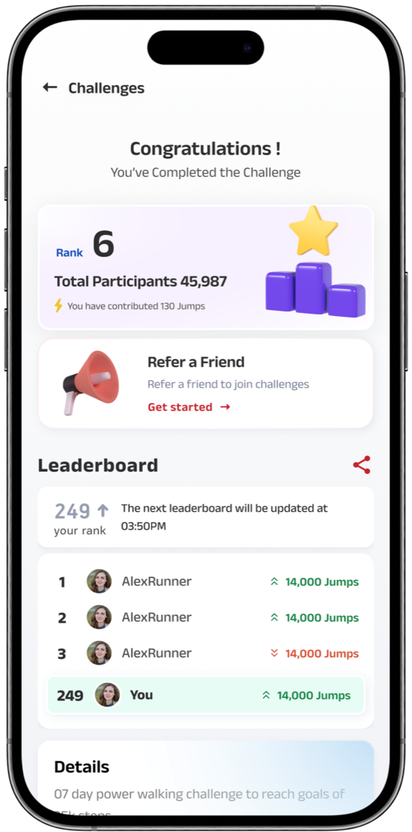
Unified steps, calories, gym check-ins, and health signals into a single Activ Dayz™ system with streaks, challenges, and milestones connected to HealthReturns™.
Tracking alone doesn't retain. A single, legible engagement engine — where every healthy behaviour rolls up into one visible currency tied to a real reward — closes the loop between behaviour and benefit.
Impact
High — drove the 50% growth in reward redemptions.
Context
Trade-off: information density required careful control — too many cards created noise; too few reduced discovery. Threshold tuned through usability testing.
Choice
Consultations, checkups, and wellbeing actions surfaced as contextual cards tied to the user's scores, activity, and reports — not as items in a static menu.
Discovery patterns showed contextual surfacing raises relevance. Showing the right action at the right moment changes whether a user engages with a feature at all.
Impact
Medium-high — improved engagement beyond core policy tasks.
Context
Trade-off: balanced IRDAI compliance and accessibility with user clarity. Compliance language was rewritten in plain English and re-reviewed.
Choice
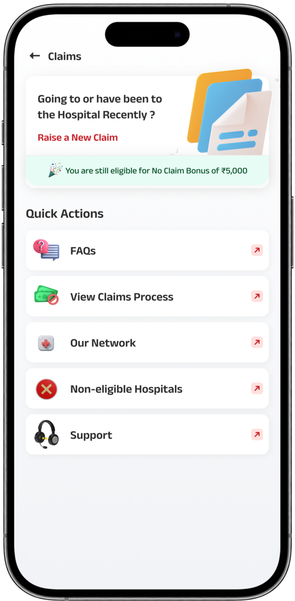
Rebuilt the claims experience around OCR-assisted upload, per-document status with timestamps, clear next steps, and realistic timelines — not a faster form.
Claims are an emotional moment. Speed without clarity creates anxiety. Transparency — knowing where each document is, what happens next, and how long it takes — reduces stress more than raw efficiency does.
Impact
High — improved claims clarity, the trust moment for the entire product.
Feature Design
09 / 12Each feature solves a specific problem surfaced in research. Here's what we built and why.
Replaced menu-style navigation with a dynamic dashboard anchored on progress — Activ Dayz™ momentum, daily challenges, and recent health signals surfaced together as a single sense of forward motion.
Trade-off
reduced top-level visibility of policy and claims modules — kept progressively disclosed.
Validation
drop-off patterns showed users needed a clear return incentive, not a menu.
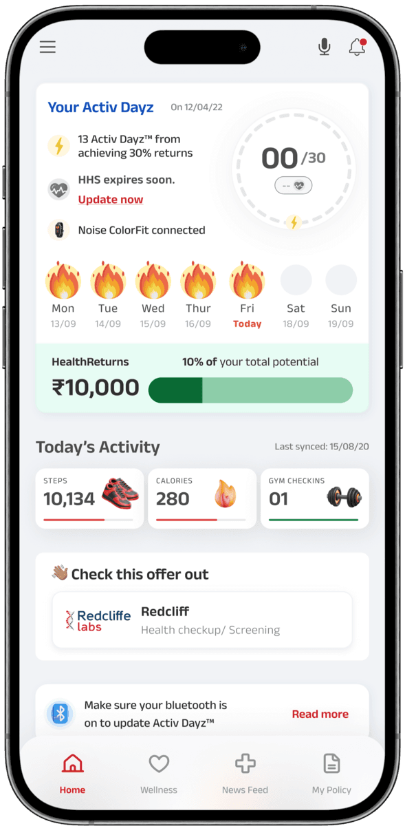
Unified steps, calories, gym check-ins, and health signals into a single, legible engagement system. Streaks, challenges, and milestones connect daily behaviour to HealthReturns™ — turning healthy actions into visible, claimable rewards.
Trade-off
prioritised simple progress indicators over deep analytics dashboards.
Validation
behavioural insights showed tracking alone doesn't retain — tangible rewards do.
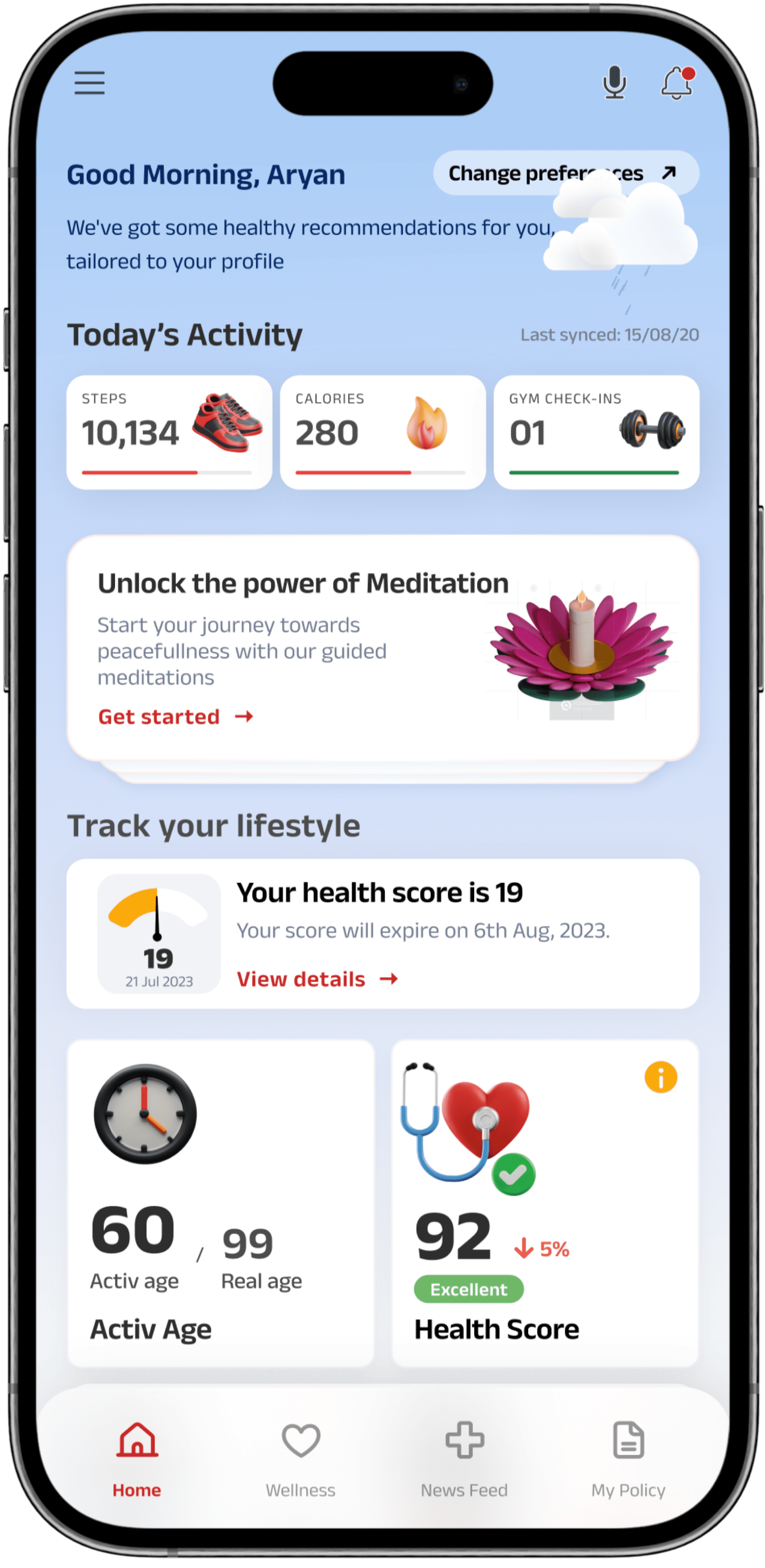
Surfaced consultations, checkups, and wellbeing actions as contextual cards — connected to the user's scores, recent activity, and health reports rather than buried in a static menu.
Trade-off
controlled information density to prevent overwhelm.
Validation
discovery patterns showed contextual surfacing raised feature relevance — the right action at the right moment beats a comprehensive menu.

Rebuilt the claims experience around transparency — OCR-assisted document upload, per-document status tracking with timestamps, clear next steps, and realistic timelines for each stage.
Trade-off
balanced compliance with speed and clarity — accuracy and trust before raw efficiency.
Validation
transparency reduced confusion in an emotionally heavy journey.
Results
01 / 04
Active Users
Increase in active users post-relaunch
02 / 04
Reward Redemptions
Growth in HealthReturns™ reward redemptions
03 / 04
Engagement
Enhanced engagement beyond policy and claims tasks
04 / 04
Claims Clarity
Improved claims clarity while maintaining compliance and accessibility
He brought strong product thinking to simplify complex health and insurance workflows into intuitive, motivating experiences — consistently challenging our assumptions and shaping the product strategy along with the design.
Marketing Head
Aditya Birla Health Insurance
Reflection
11 / 12Key Learnings
Engagement is designed through loops, not features. A standalone feature — however well-designed — doesn't create habit; the return mechanism is the design.
Tangible rewards change behaviour and increase redemption. Visible, claimable benefits shift the calculus of daily engagement in a way that informational rewards never do.
Trust moments — claims transparency above all — define regulated products. Get the anxious moments right, and the rest of the product earns the room to be ambitious.
Segment-based personalization is necessary, not optional. Different user types (fitness-tracking professionals vs chronic-condition managers) need fundamentally different home screens, not the same screen with different copy.
Test motivation mechanics and reward framing early. The difference between adoption and rejection often lives in how the value exchange is communicated, not what the underlying mechanic is.
Develop stronger coaching journeys with guided action plans. Discovery without direction creates noise; the next iteration needs to be more prescriptive about what to do, not just what's possible.
If I started again
Run a longitudinal diary study earlier in the process. Behavioural analytics capture what users do; only diary data shows how health behaviour evolves over weeks. The most durable design insights come from patterns, not moments.
Lasting impact
Deepened conviction that engagement is a design problem, not a content problem — and that trust in a regulated product is built through every micro-decision in claims, rewards, and permissions, not through marketing.
Where it landed
85% increase in active users. 50% growth in reward redemptions. Enhanced engagement beyond policy tasks, improved claims clarity, with compliance and accessibility maintained.
We take on a limited number of engagements at a time — enough to give each one the focus it deserves. If you're building in AI, fintech, enterprise SaaS, or GovTech and need a senior partner who can shape the strategy, design the experience, and help it ship — let's talk.
No commitment. No pitch deck. Just 30 minutes on your product. We respond within 24 hours.
India / Remote-first · Global partnerships