Bluemint
Creatives
Back to Work
Aditya Birla Health Insurance2024 · 8 Months

Activ Health — Daily Health Companion

The insurance app that turned daily health into daily habit.

0

Active Users

0

Reward Redemptions

0

Discovery to Ship

Experience StrategyBehavior-led DesignInformation ArchitectureEngagement SystemsClaims UX
Activ Health — Daily Health Companion — home screen
Activ Health — Daily Health Companion — secondary screen

Client

Aditya Birla Health Insurance

Year

2024

Role

Lead UX Designer

Duration

8 Months

The Brief

01

The Story Behind It

The Situation

Activ Health had high acquisition but low retention. Users had no reason to open the app unless something went wrong — making it the kind of product you dread needing, not one you actually use. The existing experience led with policy modules, surfaced rewards nobody understood, and offered no daily reason to return.

What We Did

We redesigned the experience around daily behaviour: a progress-led home anchored on Activ Dayz™, a unified engagement engine connecting healthy actions to HealthReturns™ rewards, wellness surfaced contextually at the right moment, and a simplified claims flow built for transparency — not just speed. Eight months. One clear thesis.

What Changed

85% increase in active users. 50% growth in HealthReturns™ redemptions. Engagement extending beyond policy tasks. An insurance app users open by choice — and a claims experience that earns trust when it matters most.

CapabilitiesExperience StrategyBehavior-led DesignInformation ArchitectureEngagement SystemsClaims UX

What Drove It

02

Research & Design Bets

What the research showed, and the bets we made in response.

What We Found

Tracking alone doesn’t retain

Users return when there’s a tangible reward connected to the behaviour — not when the app simply logs it. Tracking in isolation never creates habit.

Drop-off shows users need a return incentive

The app needed a clear, daily incentive surfaced at the top — not buried under policy modules. Every visit needed to feel rewarding to earn the next.

Claims are an emotional moment, not a form

Transparency — clear status, timestamps, next steps, timelines — reduced anxiety more than speed did. The trust moment for the entire product.

The Bets We Made

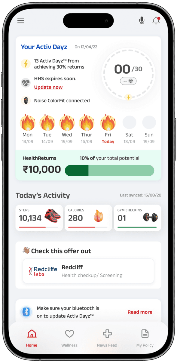
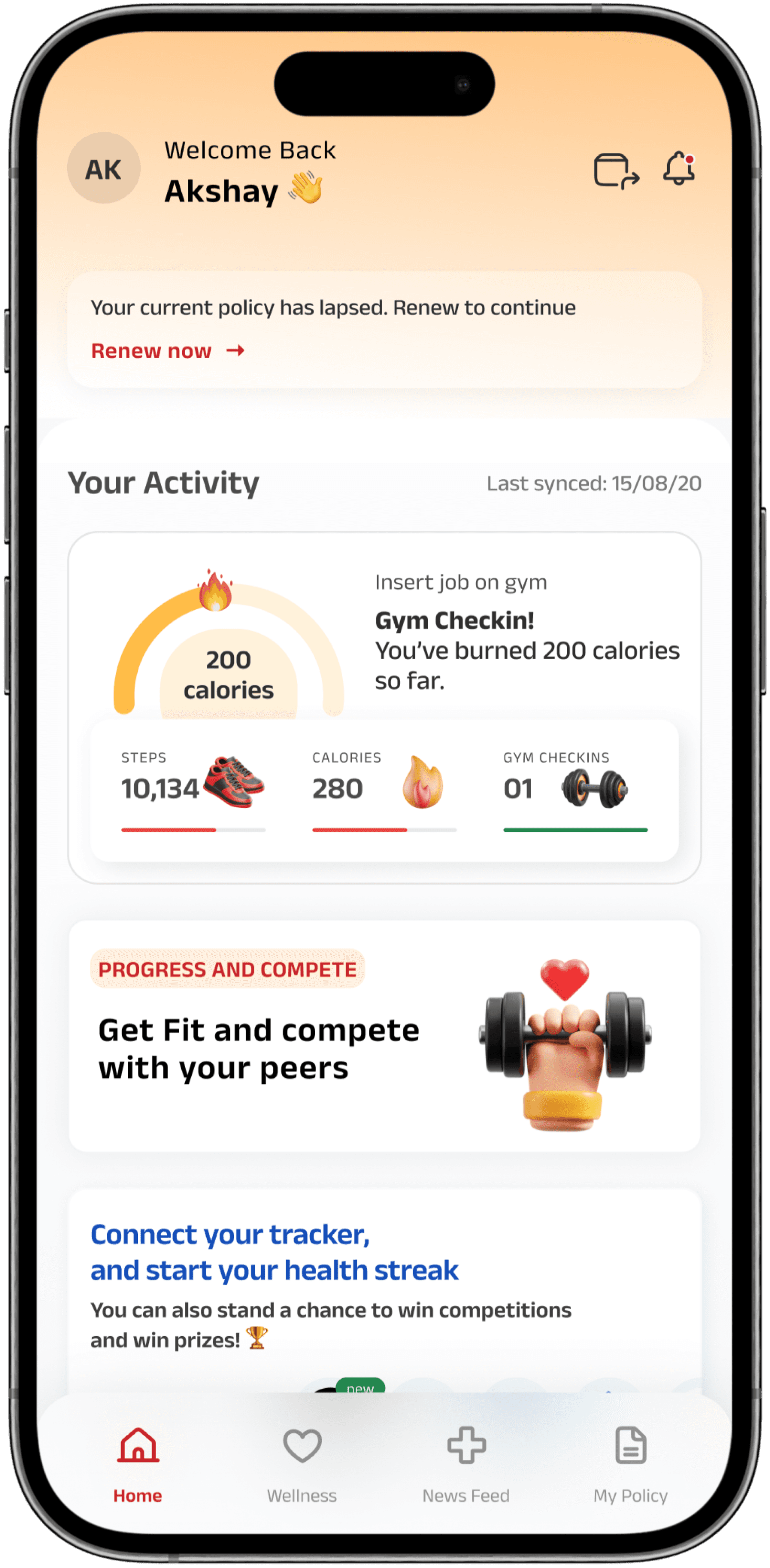
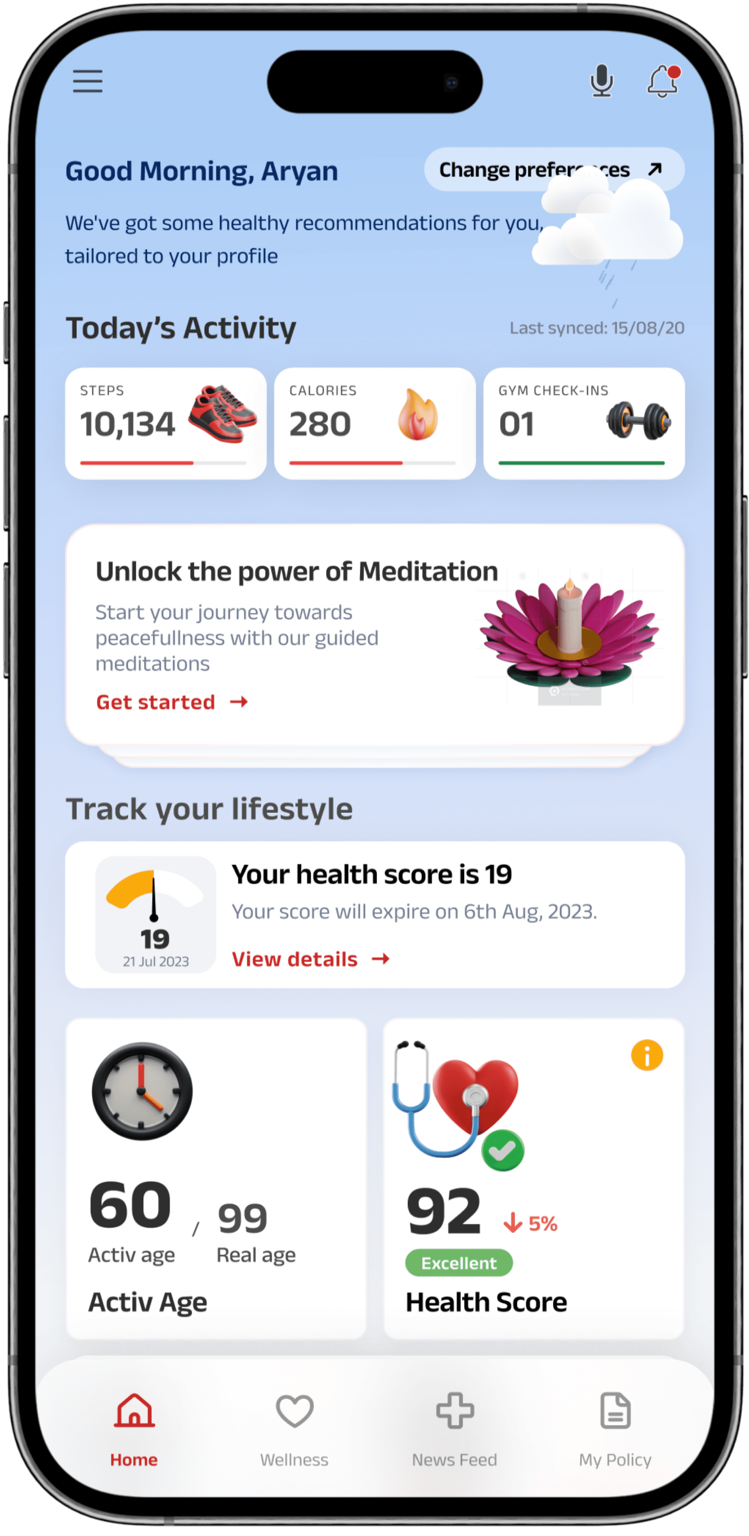
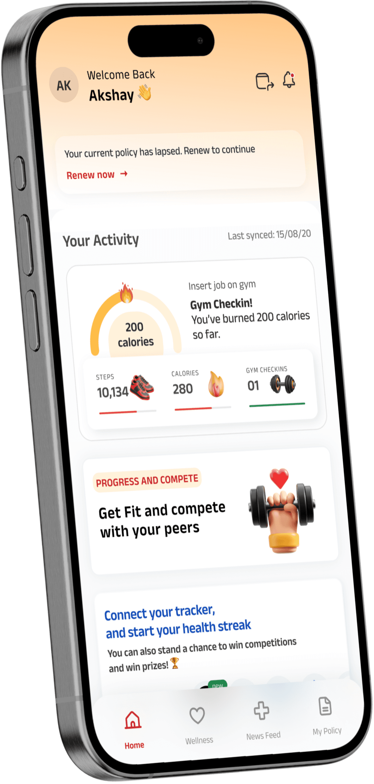
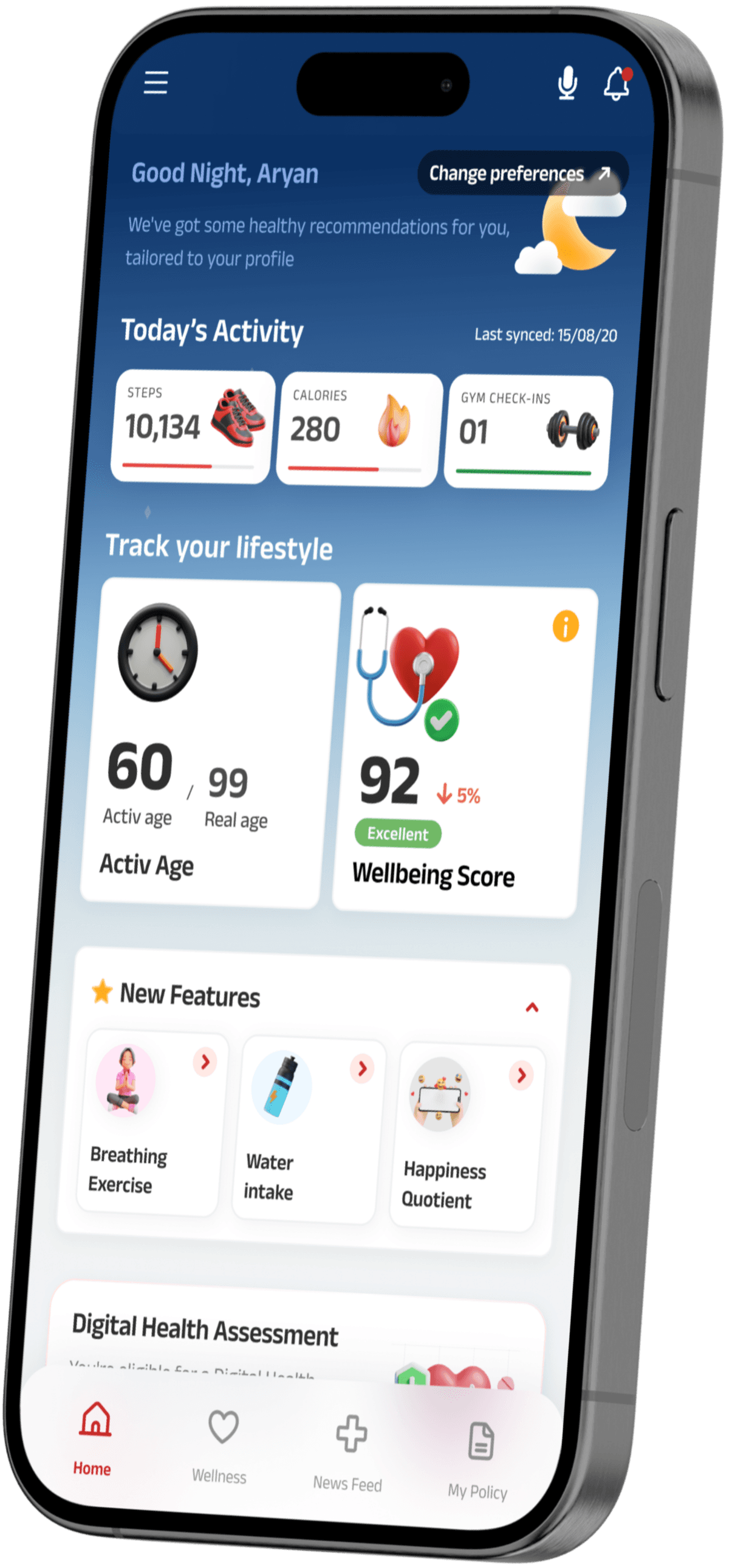
Home as progress centre

Situation

Insurance apps are opened reactively — no daily use case, no reason to return between claims.

The Bet

Lead with daily progress — Activ Dayz™, challenges, today’s signals — so every visit earns the next.

The Payoff

Primary lever behind the 85% increase in active users.

One engagement engine — Activ Dayz™

Situation

Tracking was fragmented. Steps, gym, vitals — three separate signals, zero connection to rewards. Users who tracked still dropped off.

The Bet

One currency — Activ Dayz™ unlocks HealthReturns™ — closes the loop between effort and reward.

The Payoff

Core driver of the 50% growth in reward redemptions.

Claims built for transparency, not speed

Situation

Users called support during claims — the app never told them what happened next.

The Bet

Per-document status, timestamps, and realistic timelines — not a faster form — reduce anxiety at the moment it matters most.

The Payoff

Improved claims clarity while maintaining IRDAI compliance and accessibility. Earned trust that carries through the whole product.

The Structure

03

Architecture & Core Primitives

Architecture defined before a single screen was drawn — structure shapes behaviour.

Information Architecture

Core Primitives

The Work

04

Screens That Shaped the Product

Every screen below was driven by a research insight — here's the decision chain from problem to pixel.

An app you dread needing is an app you never use.

Screen 01 / 04

An app you dread needing is an app you never use.

Insurance apps are architecturally designed for the crisis moment — and every decision in the product reflects it. Policy modules, claims access, document storage. Right for emergencies. Useless every other day. Drop-off data confirmed what users couldn’t say directly: they’d acquired the app, activated it, and then disappeared. Not churned. Just absent. There was no reason to open it until something broke.

The Design Decision

We broke from the category convention entirely. The home became a live progress surface — Activ Dayz™ momentum front and centre, today’s challenges, health signals in motion. Insurance stays one tap away, but it’s no longer the entry condition. The redesign question wasn’t ‘how do we improve the home screen?’ It was ‘why would someone open this app on their healthiest day?’ That question produces a completely different answer.

The 85% lift in active users came from changing the reason to open the app — not from any individual feature.

You can’t redeem rewards you didn’t know you had.

Screen 02 / 04

You can’t redeem rewards you didn’t know you had.

Activ Health already had a fully built rewards programme. Users had no idea. Steps counted in one tab, gym check-ins elsewhere, vitals in another — three independent sources of health data with no visible relationship to each other, and none of it connected to the HealthReturns™ benefits sitting unclaimed in users’ accounts. The data was being collected. The rewards were real. The loop that should have connected them was never closed.

The Design Decision

We unified every health signal into a single currency: Activ Dayz™. One number that accumulates across all behaviours and converts directly into HealthReturns™ benefits — making the connection between effort and reward impossible to miss. The bet was that a visible, closed loop would drive return behaviour more powerfully than any new feature. We weren’t adding to the system. We were making the existing system legible.

50% growth in HealthReturns™ redemptions — from making existing rewards visible, not from adding new ones.

The features existed. Nobody found them.

Screen 03 / 04

The features existed. Nobody found them.

Consultations, checkup reminders, wellbeing programmes — all built, all live, all in the app. Organised by category, buried three taps into static menus, visible only to users who already knew they existed and knew where to look. Discovery data told the story plainly: the majority of users had never once interacted with wellness features. Not abandoned after trying them. Never encountered them at all.

The Design Decision

We removed the navigation requirement entirely. Wellness now surfaces as contextual cards — driven by the user’s current health scores, recent activity, and data signals — appearing when they’re relevant, not when the user goes searching. The architecture shifted from organising by feature type to organising by what this specific user needs at this specific moment. The features didn’t change. The conditions under which users encountered them did.

Wellness engagement moved from near-zero to consistent weekly use — same features, entirely different surface area.

At the worst moment, silence reads as failure.

Screen 04 / 04

At the worst moment, silence reads as failure.

Claims happen at a health event — which means in the middle of some of the most stressful moments in a person’s life. The existing flow was technically functional. It accepted submissions. Users still called support at high rates anyway — not because they couldn’t file a claim, but because once they did, the app went silent. No status update. No next step. No indication of what happened or when it would resolve. In the absence of information, users assumed the worst.

The Design Decision

We stopped optimising for efficiency and started optimising for certainty. OCR-assisted upload reduced friction at intake. Per-document status with timestamps made every stage of the process visible — nothing implied, nothing left to interpretation. Realistic processing timelines replaced generic confirmation screens. The goal wasn’t a faster form. It was an experience where a user in their most anxious moment always knows exactly where they stand.

Support contacts dropped post-launch, and the claims experience became the highest-trust moment in the product.

The Outcome

Results That Proved the Thesis

01 / 04

0

Active Users

Increase in active users post-relaunch

02 / 04

0

Reward Redemptions

Growth in HealthReturns™ reward redemptions

03 / 04

0

Engagement

Enhanced engagement beyond policy and claims tasks

04 / 04

0

Claims Clarity

Improved claims clarity while maintaining compliance

He brought strong product thinking to simplify complex health and insurance workflows into intuitive, motivating experiences — consistently challenging our assumptions and shaping the product strategy along with the design.

Marketing Head

Aditya Birla Health Insurance

Before We Go

06

What This Project Taught Us

Key Learnings

  • In health and insurance apps, daily engagement is a system design problem, not a feature problem. It requires a closed loop — behaviour, visible progress, tangible reward. A well-designed loop outlasts any individual feature.

  • Trust is built at the anxiety moments: claims, coverage queries, document submission. Getting these flows transparent and clear earns the right to be ambitious everywhere else.

  • Health behaviour and insurance needs vary so fundamentally by segment that a single home model will fail for most users. Segment-led IA — daily users vs. episodic claimants — is the product strategy, not a personalisation layer on top of it.

Let’s Collaborate

Building a health or insurance product?

We bring the same behavior-led thinking — engagement systems, trust design, and IA that users actually follow — to your next product. Let’s talk.

Book a Call

Usually reply within 24 h

Let's work together

Complex problem? Bring it.

We take on a limited number of engagements at a time — enough to give each one the focus it deserves. If you're building in AI, fintech, enterprise SaaS, or GovTech and need a senior partner who can shape the strategy, design the experience, and help it ship — let's talk.

No commitment. No pitch deck. Just 30 minutes on your product. We respond within 24 hours.

India  /  Remote-first · Global partnerships